Nokia Lumia 920 Review

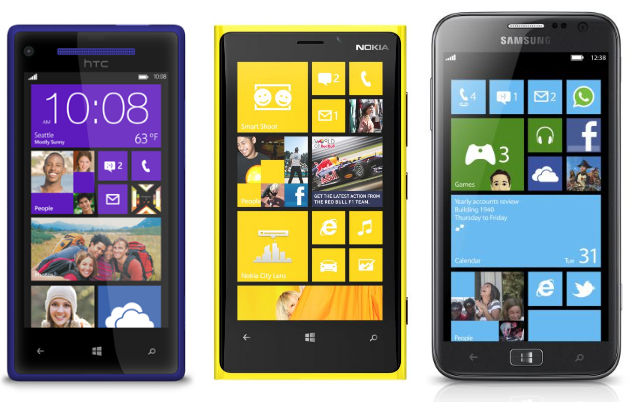
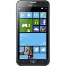
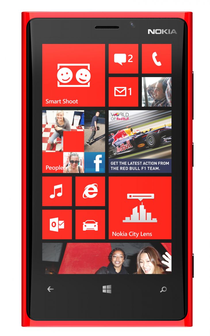
The first thought to enter your mind when opening the Lumia box is “Wow” – the design is so different to the other smartphones on the market, yet remains identifiably Nokia. With the fabula design, Nokia has managed to set itself apart with a combination of elegance and simplicity. In comparison, Samsung’s Ativ S (pictured below) looks clunky and out-dated. On the design front, Nokia seems peerless in striving for new designs – the iPhone has had 2, the original curved plastic back of the 2g, 3g and 3gs, and the current design of the 4, 4S and 5 (adding an extra inch of vertical height does not count as a design overhaul); HTC has churned out the same rounded-edge rectangles in grey for years, until borrowing a few design cues from the Lumia range for its 8X and 8S handsets; and Samsung is profiting nicely from copying the iPhone. The Lumia 920 always got a comment when it was taken out of my pocket, and it was always positive.
samsung ativ s
Samsung Ativ S displaying a lack of design intuition
700-nokia-lumia-920-red-front
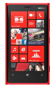
Lumia 920 in Ferrari red boasting a unibody design with a curved screen

Your second thought comes after picking it up – the weight is nothing like so many reviews would have you believe. Some state the phone makes their arm ache, it’s uncomfortable to hold to their ear, it doesn’t fit in their pockets and it’s a struggle to hold. This is a device that weighs not even 200g – heavy compared to other smartphones, but by no means heavy in an objective definition. The fact is, complaints about weight are not doing much to improve the stereotype of wimpy geeks.

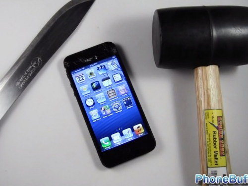
The 920 feels like a premium device – by no means will it make your arms ache (and if it does, a visit to the gym now and then would be recommended), but you will know you’re holding it. Compared to the iPhone 5’s feel of almost weightlessness, the 920’s feel is my preference. Holding the iPhone 5 makes me worry that holding it too tight will cause it to crumble, and the end result is most people will choose to cover it in a case that bumps the weight up to that of the 920 anyway. With the 920, the usual fear of damaging a trial device isn’t there – videos are abundant on YouTube of people going to extreme lengths to try to damage the device, with most failing to do so. No case or screen protector is necessary, and after more than a month of using it, there was not one scratch on either the screen or body.

One of the big features of the 920 is the ClearBack Display boosting readability levels when outdoors. This has been a smartphone plague since day one, and nothing caused me more frustration on my Samsung Galaxy II than trying to read an email outdoors – even minimal sunlight rendered readability to zero. By comparison, I never once had to shield the 920’s screen to make out what it was displaying; during my review period I visited Arizona, and even beneath its bright sunlight it was like looking at the screen indoors. It’s without doubt the best screen the market has to offer, and a feature Nokia should be shouting about.

Fortunately for the review, I was also able to test it in the English winter. Could it really work with gloves? Yes, it can. Reasonably thick leather ones too, with stunning accuracy. Finding a contact to call and even typing messages were no problem. When resistive screens were still reasonably popular, I was an advocate of them for the simple reason that they registered clicks from things besides flesh; the inability of capacitive screens to do so is a glaring problem and one that manufacturers have been content to ignore. Perhaps a perk of being based in Finland, a country that experiences winters California can’t even dream about, Nokia saw this weakness and overcame it – to such an extent that it even registers input from big ski mitts. If you’ve ever missed a call because you couldn’t get your glove off in time, you’ll understand the benefit of this technology.

One of the other features is Nokia’s Rich Recording, a feature only present on Nokia’s recent devices (you’ll be forgiven for having not heard of it, as Nokia has hardly mentioned it). Chances are you’ve seen a video on YouTube of a concert filmed on a mobile phone, or even recorded your own, and not had a clue what the song is supposed to sound like when you play it. If you own a non-Nokia device, you’re pretty much guaranteed that experience. If you do have a Lumia or the 808 PureView, though, then you will be able to record audio and listen to it later with such clarity it’s as though you’re still there. Want an example? The video below compares the 920 with HTC’s Windows Phone flagship the 8X.


If there’s one feature that the 920 boasts and people do know about, it’s the camera – specifically the low-light capabilities. It’s one thing when a manufacturer touts these things, but there’s never a guarantee they’ll work that way in real life conditions. Here are some sample shots I took in low-light, with no flash.

WP_20121204_009

WP_20121204_014
Incredible detail in a garden at night. The only source of light is from the window.
WP_20121204_015
Same shot as above, but with flash.
WP_20121208_004
Photo taken at night with the light off, no flash used.
And two to demonstrate the quality of the photos in normal conditions:

WP_20121206_005
A curious dragon
WP_20121215_006
Ice on a Canadian peak, taken from 35,000ft

The camera has some interesting features besides its incredible low-light abilities, and they never ceased to amaze my iPhone-owning friends (and at least two wanted to immediately drop their Apple and get the 920 instead). Smart Shoot in particular always got stunned expressions when a person or object was simply removed from a picture, or the option to flip through multiple shots to pick the best one – ideal when someone is blinking or moving. Cinemagraph also elicited shocked responses as the picture suddenly became alive with waves, smiles and moving objects. The camera capabilities, including the aforementioned Smart Shoot and Cinemagraph, put Nokia on a plane that its competitors can only dream of matching. In fact, the camera technology Nokia has in the 808 PureView runs rings around Samsung’s dedicated Galaxy camera.

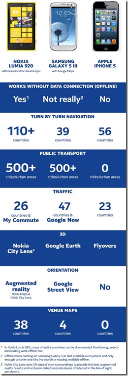
The software on the phone is excellent too. The native Nokia Maps were used frequently during my time in America – always offline and they never missed a beat. From the back hills of California to the freeways along Pacific Highway, as well as finding stores like Target, it worked first time every time. It’s easy to take for granted just how good those maps are, but a recent use of Apple’s “sat nav” really proved how capable Nokia’s offering is. The iPhone version does not display the speed limit, the travelling speed, the time until the destination or any other information. When approaching a junction, it does not say “Turn left now”, and about one-third of the screen is taken up with the roadsign image – meaning that you can only see on the screen about the next 30 yards of road, and that makes it impossible to know what your next move is, and thus which lane to be in. Although it knew where we were trying to go, and did get us there, the way it did so was frustrating and, at times, outright dangerous. On a three-hour journey in a motorhome in California, questions of “How long until we get there?” were unanswerable by those on iPhones, partly because the maps don’t give that information and partly because when there’s no signal, there’s no information. The 920 gave the information within ten seconds of it leaving my pocket. It’s the differences like these that truly demonstrate just how far ahead Nokia is with its maps – being able to immediately pick up your location, your destination and the time between, while offline, is one feature that will be sorely missed by anyone who uses it and then uses a competitor device.

Maps also has the City Lens feature of augmented reality. When visiting somewhere new this is an excellent, and fast, way of finding what you need. You can hold the phone up to your surroundings and see what’s around you, or hold it vertically for a list. Tap an item and you can see photos, read reviews, call the place, or get directions using Nokia Drive. Seamlessly integrated, and probably the quickest, easiest way of discovering new things presented by any phone.

The other main feature of the 920 is its wireless charging capability. Although it still requires contact, of being placed onto the pad, it’s quite shocking how much easier it makes things. It’s a common problem that the charging cables are too short to reach from a bedside cabinet to the bed, which means fumbling in the dark if the phone goes off, trying to unplug it, not drop the cable, and then plugging it in again when you’re done. The wireless charging ability means you pick it up and put it down like you would normally, except it carries on charging as you put it down. It’s a simple action that makes things much easier, and since the 920’s release other manufacturers have rushed the feature into removable cases for existing handsets. That being said, the irony of the 920 having it is that it’s a battery seemingly impossible to kill anyway – no matter what my usage was (games, video, music, web browsing, voice calls, text messages, WhatsApp etc), it would never die before I put it on to charge at night. That was a solid 14+ hours every day, and on days of medium usage, I wouldn’t bother charging it overnight and it would last until the following evening.

The Windows Phone 8 software has been largely discussed already and there’s not much more to add. The new Start screen is very impressive, and going back to Windows Phone 7.5 after using 8 makes you appreciate how much better the upgrade is. The 920 is extremely fast and fluid, and the operating system is obviously designed to make everything so simple to get – from Search results offering relevant apps to improved live tiles, and resizeable tiles making information so much easier to get to. Kid’s Corner is a feature that I have no use for, but see the need for other people to have. In fact, on one trip to Target, there were three women looking at a children’s iPhone dock, of which the main feature was, according to one ecstatic shopper, “it blocks the home button being pushed so the kids can’t make calls and stuff.” Kid’s Corner, for those who haven’t yet heard of it, is an area of the phone where you can decide what apps and games are available, so the children can use the phone to play Angry Birds but you don’t have to worry about them deleting emails and contacts or making expensive calls. It’s a feature that is sorely needed by millions of parents, and you don’t need a separate accessory that only does one small fraction of Kid’s Corner. For Android and Apple, there isn’t an app for that.

Windows Phone 8 also brings the much, much needed backup ability. It isn’t quite as good as other options though – from Nokia’s previous Symbian and Maemo options, and iOS and Android, all let you backup a local copy to the PC whenever you want. Microsoft has oddly chosen not to do this, and in WP8 certain things, including text messages, are stored to SkyDrive. It’s not the complete option that we expect, and Microsoft needs to address the issue immediately – who is going to store data they can’t afford to lose on a device that doesn’t allow them to back it up?

Nokia is touting the 920 as the most innovative smartphone in the world. With wireless charging, the best screen on the market bar none, outstanding maps, Rich Recording, Optical Image Stabilisation, PureView camera technology, Lenses and the near-indestructible build quality that has led to countless people trying to destroy it in videos, there’s no choice but to agree. It’s no surprise the Lumia 920 won 12 awards in 2012, and couple that with a fast, simple and refreshing operating system, Nokia has a clear winner in the Lumia 920.


Windows Reimagined: The Microsoft Ecosystem

Amidst all the talks of the newly launched Windows 8 and Windows Phone 8, talk has naturally focused on the specific systems. In the case of Windows Phone, the features have been getting all the attention – what does it offer? Is it as good as the iPhone? What most people aren’t observing, though, is the ecosystem; and it’s the ecosystem that is Microsoft’s main strength.


Apple positioned itself as the media leader with the release of the iPod and iTunes, and the reputation has only strengthened with newer incarnations of the iPod and iTunes’s increasing amount of content. Microsoft was never a serious contender to this crown because its services just weren’t very good – the home media centre was clumsy and complicated at best; Windows Mobile was outrageously cumbersome; and it just didn’t have the music and video content to compete with Apple. Microsoft had a reputation as the Old Guard, too far gone to ever compete with the trendy Apple.


But Microsoft had something of worth: the Xbox. With humble origins as a simple games console, it quickly blossomed into a media hub where you could watch things like BBC iPlayer and 4OD. Today you can use any number of apps, browse the Web, connect with friends, rent or buy films from Xbox (previously Zune) or streaming services like Netflix and LoveFilm. Then came Kinect, which lets users swipe their hand and scroll through their content, or talk to the console and tell it what to do, including Bing searches. The Xbox was Microsoft’s foot in the modern world that the company had to utilise to stay relevant in today’s world of sparkly, fast gadgets that rely on connectivity and being social.


Microsoft has utilised it to a commendable degree. While previous incarnations of Windows theoretically had home entertainment capabilities, they weren’t great. Windows 8 and Windows Phone 8, however, really show what the ecosystem is capable of. The Smartglass app allows users to play a film on their tablet, then let the Xbox pick it up to continue playing, and switch it back to the tablet again. Better yet, when an actor comes on screen, Smartglass on the phone or tablet will tell you who that person is. Tapping on the name will bring up a bio and filmography – it’s like going to their IMDB page, without going to IMDB. If you’re watching a film on LoveFilm and using Smartglass, it automatically sees the film you’re watching and gives you the overview, cast and reviews. You can also pause, rewind and forward the film through the app.


Seeing all the devices work together at Monday’s launch event was an impressive sight, and it highlights the futility in focusing solely on one device’s specs. Forget the devices themselves for now, push aside the nifty features like Kid’s Corner, live updates pushed to your home screen and Nokia’s stunning features in the Lumia 920. What Microsoft has aimed for, and executed marvellously, is a complete home entertainment system. Google’s Web services may be extensive, but they don’t provide anything of this calibre. Apple has something similar with Apple TV, but the communication between the devices isn’t the same. For instance, Apple TV lets you play your media on the TV wirelessly, but the iPhone will not then recognise who is on the screen and tell you all about them, nor does the phone become a remote control. Xbox Music is a Spotify-esque service that provides unlimited streaming, and offline playlists, for a mere £90 a year. Films can be rented or bought from the console, computer or phone and synced seamlessly between the devices through the user’s Microsoft account. Microsoft also made the smart decision of giving users control of their content – media downloaded from Xbox will work on the devices you want it to, not only on Microsoft devices.


While there’s no denying that uptake of Windows Phone remains slow, it’s now clear that Microsoft has created a wonderful ecosystem and the phones are only one segment of that. The Xbox dashboard looks almost identical to Windows 8 and Windows Phone, and that universal design is exciting to see. The ecosystem is visually immersive and extremely attractive – suddenly the grey list on iTunes looks dated. The tiles interface has also been utilised by other companies, including Google’s Play Store, Netflix and LoveFilm, which can only help boost recognition of Windows too. With Microsoft having changed what a PC can look like, there are millions of consumers who may suddenly see the appeal of a personal system like Windows Phone.


Whether Windows Phone 8 gains any more traction remains to be seen, but one thing’s for sure: Microsoft has turned a corner and is reinventing itself as a fresh, vibrant company with what may be the most compelling ecosystem out there – and that’s before we even consider Office, Skype and the business offerings.


iPhone 5 “Scuffgate” & Lumia 900 Durability

Since the release of the iPhone 5, Twitter has had a new trend: Scuffgate. It’s not been the best week for Apple, with the company being criticised for its maps, and the camera suffering from a purple hue for many users. Scuffgate, however, refers to many users noticing how easily the new iPhone scratches and scuffs, to the point that some are even taking damaged iPhones out of the box.

The reason the iPhone 5 scratches easily is because it uses anodised aluminium, and Apple Senior Vice President of Marking Phil Schiller has described this as normal, saying in response to a user email that “Any aluminum product may scratch or chip with use, exposing its natural silver color. That is normal.”

It’s not actually as normal as Schiller would like consumers to believe. Apple uses anodised aluminium for its Macbooks and iMacs, and they do not suffer the same problem. Nokia also uses it on its products E7 and N8, both of which are known for their ruggedness and durability. Aluminium itself may be a soft metal, but it is not “normal” for a phone to arrive scratched – if it were, Apple should have rethought the idea to use it. The real issue is that coating is very thin on the iPhone 5, making it particularly susceptible to scratches and scuffs.


For comparison, here’s a video of the N8 being deliberately scratched:


And while we’re on the subject of phone durability (and Apple’s lack of it), the Lumia 900 gets put through its paces to see how much damage it can take:

Frozen for 2 hours.

Cooked for an hour at 200F

Used as a hammer

Thrown from a moving car twice

Dunked in a pool

Results here:


Windows Phone 8: HTC, Nokia and Samsung

As of a few days ago, the current count of phones that will ship with Windows Phone 8 is…five. Two from Nokia, two from HTC and one from Samsung.

With Windows Phone 8 set to officially launch in October, it seems that many phone manufacturers wish to jump on the wagon and make some money. In this day and age, any competition is good, pushing companies to one-up one another creating the better device and consumers reaping the rewards. As long as no company is copying another, all is good (won’t go too much into the recent Apple vs Samsung fiasco because to be honest, who cares?). So what is currently being offered by the three big non-fruit phone makers then?

The best iPhone yet...wait wha?

I shall start with the Samsung Ativ S. For all those hoping for something different, you will be disappointed. It is as if Samsung has taken the Galaxy S3 and put WP8 on it with a compatible CPU. The Ativ S has the same 4.8 inch display, almost the same form factor (although less “round” than the S3) and the same 16GB or 32GB option plus microSD card slot.

The Nokia Lumia 920 and 820 are a different story. Building upon the reasonably successful design of the Lumia 900 and 800, the successors are set to take back what was rightfully Nokia’s – the claim to the mobile phone throne. The only differences between the two Lumias are the Lumia 820 has a smaller form factor and has a 4.3 inch 480 x 800 pixels display using AMOLED technology, 8GB of on-board memory plus an added microSD slot. The Lumia 920 does away with the microSD slot and gives everyone 32GB of memory. There is a 4.5 inch display pushing 1280 x 768 resolution, yes that is beyond HD 720p (slightly taller than widescreen) @332 ppi density – higher than retina. The touch screen technology is IPS with ClearBlack offering incredible vibrance contrast and is super sensitive meaning that one no longer has to use just their fingers to navigate their phone; a great feature especially if you use gloves or prefer to use a pointer for writing and drawing. The Lumia 820 has interchangeable covers one of which includes a wireless charging backplate but the Lumia 920 has this as standard.

820 far, 920 close

Both phones will have front facing cameras, albeit the 820’s one only being capable of VGA whilst the 920 one is capable of 1.2MP. As with the main camera, the 820 will have an 8PM camera plus flash whereas the 920 will have a 8.7MP one with PureView with Optical Image Stabalisation and a camera backlighting technique that captures low light images as if they were shot during the day.

Wireless charging? Yes please!

Both phones will be available in a selection of colours, are LTE (4G) capable and will be offered exclusively on UK’s 4GEE (Everything Everywhere) network, which is a bummer for guys like me who aren’t on T-Mobile or Orange, EE’s partner networks, and wanted to upgrade later this year.

The copycats

And finally we get to HTC. HTC unveiled its newest Windows Phone 8 devices, the 8X and 8S. With a similar naming scheme to the One X and One S, one would expect the WP8 siblings to have similar specs and appearance, just like with any HTC product, and one would be right, sort of. The HTC 8 series boast unibody designs and a selection of colours with the 8X being the larger one with a 4.3 inch display and the 8S with a 4.0 inch one. The 8X display sports a nice 720p resolution and the fact that is it 0.2 inches smaller than the one in the Nokia 920 means it has a density of 342 ppi, giving it the crown of density along with Sony’s new Xperia range. The phones will have the same processor as the one in the Lumia range. Like with all HTC phones, the classic flip clock interface is now present as a large live tile. Microsoft CEO Steve Ballmer praised the newfound partnership with the Taiwanese mobile giant but mentioned nothing of the all important billion dollar partnership Microsoft has with Nokia. What is interesting is that the HTC phones are WP8 signature ones, whatever that means, and Nokia’s Lumias aren’t. It is doubtful that this will make any difference to any of the sales, followers, stocks, arguments or trolling at all.

Now everyone can have a HUD!

During all the announcement events, the most anyone had to see of any software was at Nokia’s, where it showed apps such as City Lens – augmented reality showing POIs overlaid on your camera display. Microsoft has been very tight lipped about its operating system, which can either mean it is still unsure about something, perhaps a bug, and is unable to suppress it during any demo, or that it is highly proud of its creation and doesn’t wish to display anything until the actual release. Whatever the case, here’s to hoping it will be great.

Fight!

While the selection of devices is a bit thin, all the phones released offer something that the Apple iPhone 5 does not and that is the fresh factor – the feeling of using something new that no longer feels outdated. BlackBerry has suffered this recently and the more learned of the iPhone 5, users are definitely feeling that Apple’s innovation may be grinding to a halt. There will no doubt be those arguing about the amount of apps in the iTunes store compared to the Windows one but the point is that the main and most useful apps such as the social networking ones, RSS and mail clients, camera and productivity tools are available on both platforms.

Think the iPhone 5 Has the “World’s Most Advanced Display”? You’re Wrong.

Mobility Digest has a post exploring the screen of the iPhone 5, described by Apple CEO Tim Cook as the “world’s most advanced display” at the launch event, and comparing it to the screen on the recently announced Lumia 920 (and the 900). The result? Cook is either ignorant of his competition, or he lied. If he is emulating Steve Jobs, then we’ll place money on the latter, but who knows?

To give a quick rundown, the iPhone 5 has a resolution of 1136 x 640, compared to 1280 x 768 on the Lumia 900. The iPhone 5 also has 326 pixels per inch (PPI) vs the Lumia’s 332.

The Lumia 900 has 600 nits for brightness, the iPhone 5 has 569. These Lumia specs are from its existing model, and the 920 has progressed even further. “The next generation of Clear Back Display [Nokia’s outstanding screen technology] technology found in Lumia 920 adds a high-luminescence mode that works automatically improving contrast and brightness outdoors performing even than the old CBD in 900.”

Bear in mind that 900 won awards, against the iPhone and others, for its visibility outdoors. The 920 automatically adjusts itself depending on glare and brightness outside.

The screen refresh rate on the 920 is 50% faster than the iPhone 5, producing “a clean transition from frame to frame allowing the display to deliver a steady 60 FPS without any blurring” (head over to the Mobility Digest article to see the comparison of this).

Apple is boasting about the iPhone 5’s sensitivity – the 920 works with almost anything, including thick gloves.

The end result? Compared to the Lumia 920, the iPhone 5 results are:

Screen PPI: -2%

Screen Resolution: -25%

Screen Sensitivity: it would be embarrassing to find a percentage.

Screen Refresh Rate: -50%

Screen Brightness: -5%

Screen Reflectance: -40%

Screen Outdoor Legibility: -15%


Apple Maps: The Disaster (And How the Competition Fares)

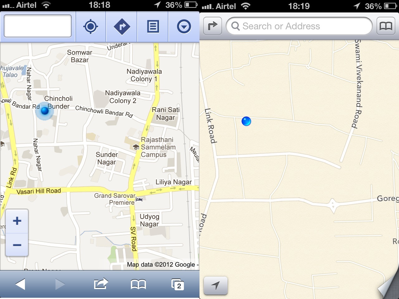
For iOS6, Apple realised the importance of mapping software as part of an ecosystem and decided to ditch Google Maps in favour of its own offering. This is fine in theory, but the problem is Apple has not got the maps to a particularly useful standard before pulling the plug on Google’s. This has led to a backlash from users, and even led to TomTom, the supplier, speaking out in defence of its service so it doesn’t get caught up in the criticism.

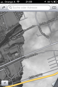
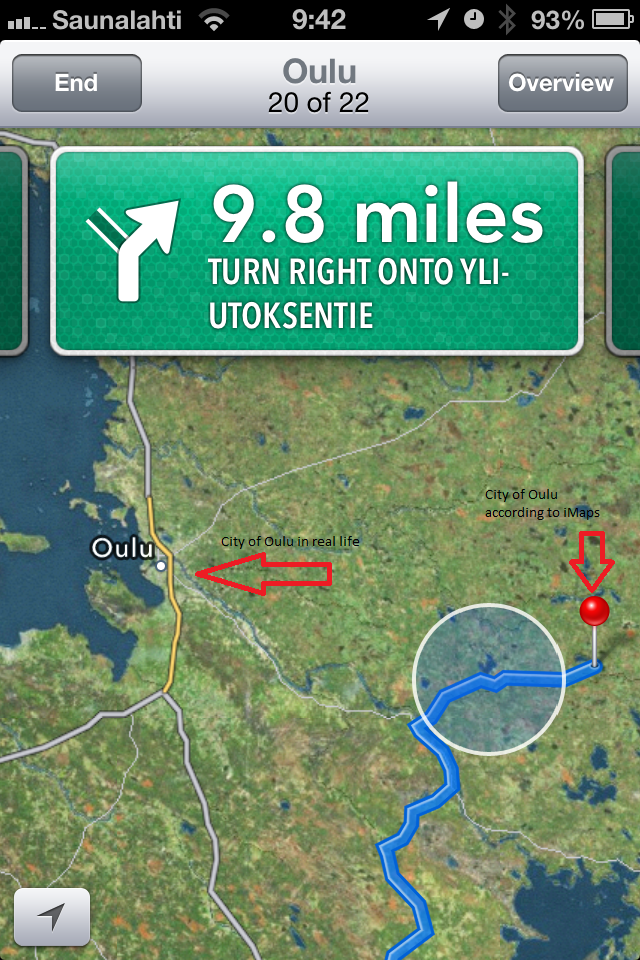
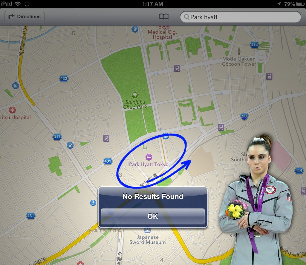
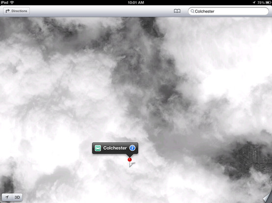
So what’s wrong with Apple’s maps exactly? A whole new Tumblr page has been created especially to show the problems, and some images can be seen below:


A bumpy landing lays ahead
Oulu is the biggest city in Northern Finland, but iOS doesn’t know where to find it
This is Bogota, Colombia. Apparently.


Mashable also has another collection of iOS6 map photos


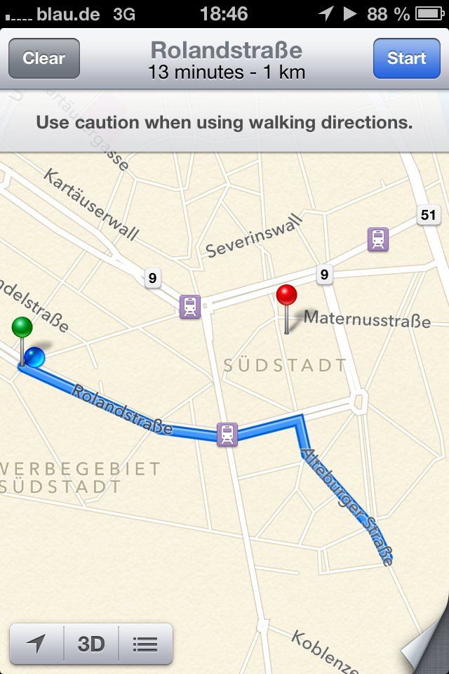
This is Apple’s idea of walking navigation. The red pin marks where the blue line should be going
Mumbai does actually exist.
Looks like the Brooklyn Bridge needs some structural attention.
 

Not missing a beat in recent months, Nokia has used this opportunity to explain how its own mapping services are the industry leaders. The new aggressive marketing from Nokia is a moment to revel in for its consumers, given the company’s reluctance in the past to hype its own innovations. In the arena of maps, Google is considered the one to beat. That may be true for mindshare, but when it comes to the most superior product, Nokia stands without peers.


Somehow, Apple is still employing its ‘reality distortion’ field and telling people that “it’s the best mapping program on any mobile platform“. The world begs to differ Apple…