Windows Phone 8: HTC, Nokia and Samsung

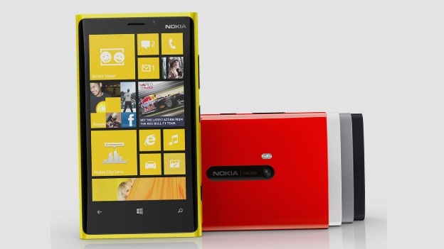
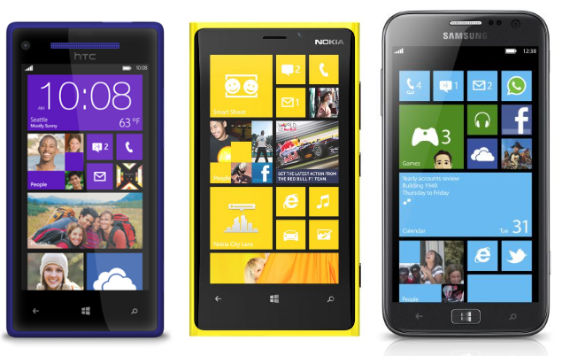
As of a few days ago, the current count of phones that will ship with Windows Phone 8 is…five. Two from Nokia, two from HTC and one from Samsung.

With Windows Phone 8 set to officially launch in October, it seems that many phone manufacturers wish to jump on the wagon and make some money. In this day and age, any competition is good, pushing companies to one-up one another creating the better device and consumers reaping the rewards. As long as no company is copying another, all is good (won’t go too much into the recent Apple vs Samsung fiasco because to be honest, who cares?). So what is currently being offered by the three big non-fruit phone makers then?

The best iPhone yet...wait wha?

I shall start with the Samsung Ativ S. For all those hoping for something different, you will be disappointed. It is as if Samsung has taken the Galaxy S3 and put WP8 on it with a compatible CPU. The Ativ S has the same 4.8 inch display, almost the same form factor (although less “round” than the S3) and the same 16GB or 32GB option plus microSD card slot.

The Nokia Lumia 920 and 820 are a different story. Building upon the reasonably successful design of the Lumia 900 and 800, the successors are set to take back what was rightfully Nokia’s – the claim to the mobile phone throne. The only differences between the two Lumias are the Lumia 820 has a smaller form factor and has a 4.3 inch 480 x 800 pixels display using AMOLED technology, 8GB of on-board memory plus an added microSD slot. The Lumia 920 does away with the microSD slot and gives everyone 32GB of memory. There is a 4.5 inch display pushing 1280 x 768 resolution, yes that is beyond HD 720p (slightly taller than widescreen) @332 ppi density – higher than retina. The touch screen technology is IPS with ClearBlack offering incredible vibrance contrast and is super sensitive meaning that one no longer has to use just their fingers to navigate their phone; a great feature especially if you use gloves or prefer to use a pointer for writing and drawing. The Lumia 820 has interchangeable covers one of which includes a wireless charging backplate but the Lumia 920 has this as standard.

820 far, 920 close

Both phones will have front facing cameras, albeit the 820’s one only being capable of VGA whilst the 920 one is capable of 1.2MP. As with the main camera, the 820 will have an 8PM camera plus flash whereas the 920 will have a 8.7MP one with PureView with Optical Image Stabalisation and a camera backlighting technique that captures low light images as if they were shot during the day.

Wireless charging? Yes please!

Both phones will be available in a selection of colours, are LTE (4G) capable and will be offered exclusively on UK’s 4GEE (Everything Everywhere) network, which is a bummer for guys like me who aren’t on T-Mobile or Orange, EE’s partner networks, and wanted to upgrade later this year.

The copycats

And finally we get to HTC. HTC unveiled its newest Windows Phone 8 devices, the 8X and 8S. With a similar naming scheme to the One X and One S, one would expect the WP8 siblings to have similar specs and appearance, just like with any HTC product, and one would be right, sort of. The HTC 8 series boast unibody designs and a selection of colours with the 8X being the larger one with a 4.3 inch display and the 8S with a 4.0 inch one. The 8X display sports a nice 720p resolution and the fact that is it 0.2 inches smaller than the one in the Nokia 920 means it has a density of 342 ppi, giving it the crown of density along with Sony’s new Xperia range. The phones will have the same processor as the one in the Lumia range. Like with all HTC phones, the classic flip clock interface is now present as a large live tile. Microsoft CEO Steve Ballmer praised the newfound partnership with the Taiwanese mobile giant but mentioned nothing of the all important billion dollar partnership Microsoft has with Nokia. What is interesting is that the HTC phones are WP8 signature ones, whatever that means, and Nokia’s Lumias aren’t. It is doubtful that this will make any difference to any of the sales, followers, stocks, arguments or trolling at all.

Now everyone can have a HUD!

During all the announcement events, the most anyone had to see of any software was at Nokia’s, where it showed apps such as City Lens – augmented reality showing POIs overlaid on your camera display. Microsoft has been very tight lipped about its operating system, which can either mean it is still unsure about something, perhaps a bug, and is unable to suppress it during any demo, or that it is highly proud of its creation and doesn’t wish to display anything until the actual release. Whatever the case, here’s to hoping it will be great.
Fight!

While the selection of devices is a bit thin, all the phones released offer something that the Apple iPhone 5 does not and that is the fresh factor – the feeling of using something new that no longer feels outdated. BlackBerry has suffered this recently and the more learned of the iPhone 5, users are definitely feeling that Apple’s innovation may be grinding to a halt. There will no doubt be those arguing about the amount of apps in the iTunes store compared to the Windows one but the point is that the main and most useful apps such as the social networking ones, RSS and mail clients, camera and productivity tools are available on both platforms.
Think the iPhone 5 Has the “World’s Most Advanced Display”? You’re Wrong.

Mobility Digest has a post exploring the screen of the iPhone 5, described by Apple CEO Tim Cook as the “world’s most advanced display” at the launch event, and comparing it to the screen on the recently announced Lumia 920 (and the 900). The result? Cook is either ignorant of his competition, or he lied. If he is emulating Steve Jobs, then we’ll place money on the latter, but who knows?

To give a quick rundown, the iPhone 5 has a resolution of 1136 x 640, compared to 1280 x 768 on the Lumia 900. The iPhone 5 also has 326 pixels per inch (PPI) vs the Lumia’s 332.

The Lumia 900 has 600 nits for brightness, the iPhone 5 has 569. These Lumia specs are from its existing model, and the 920 has progressed even further. “The next generation of Clear Back Display [Nokia’s outstanding screen technology] technology found in Lumia 920 adds a high-luminescence mode that works automatically improving contrast and brightness outdoors performing even than the old CBD in 900.”

Bear in mind that 900 won awards, against the iPhone and others, for its visibility outdoors. The 920 automatically adjusts itself depending on glare and brightness outside.

The screen refresh rate on the 920 is 50% faster than the iPhone 5, producing “a clean transition from frame to frame allowing the display to deliver a steady 60 FPS without any blurring” (head over to the Mobility Digest article to see the comparison of this).

Apple is boasting about the iPhone 5’s sensitivity – the 920 works with almost anything, including thick gloves.

The end result? Compared to the Lumia 920, the iPhone 5 results are:

Screen PPI: -2%

Screen Resolution: -25%

Screen Sensitivity: it would be embarrassing to find a percentage.

Screen Refresh Rate: -50%

Screen Brightness: -5%

Screen Reflectance: -40%

Screen Outdoor Legibility: -15%


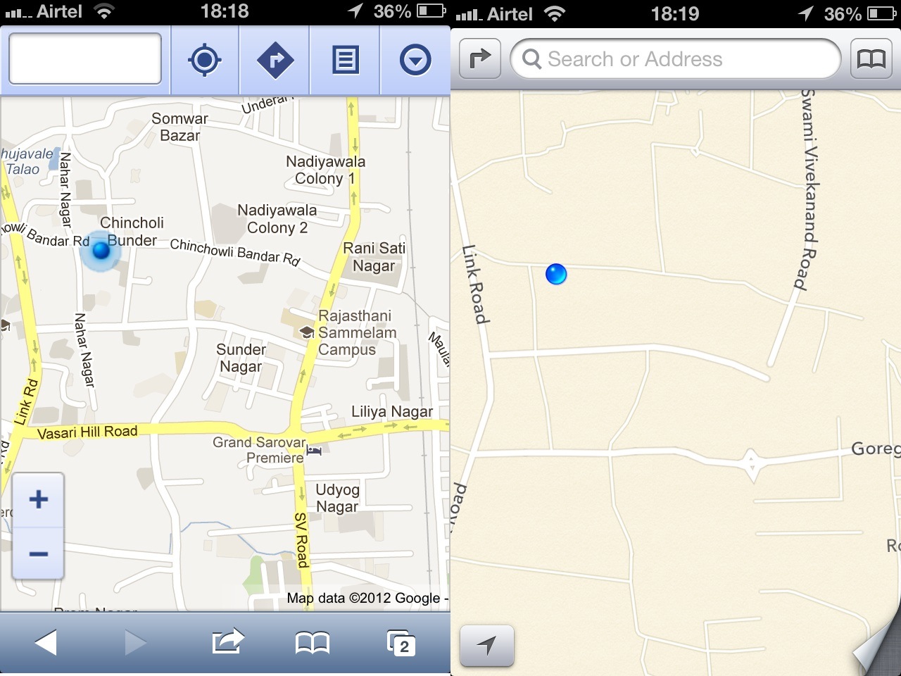
Apple Maps: The Disaster (And How the Competition Fares)

For iOS6, Apple realised the importance of mapping software as part of an ecosystem and decided to ditch Google Maps in favour of its own offering. This is fine in theory, but the problem is Apple has not got the maps to a particularly useful standard before pulling the plug on Google’s. This has led to a backlash from users, and even led to TomTom, the supplier, speaking out in defence of its service so it doesn’t get caught up in the criticism.

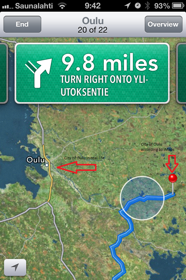
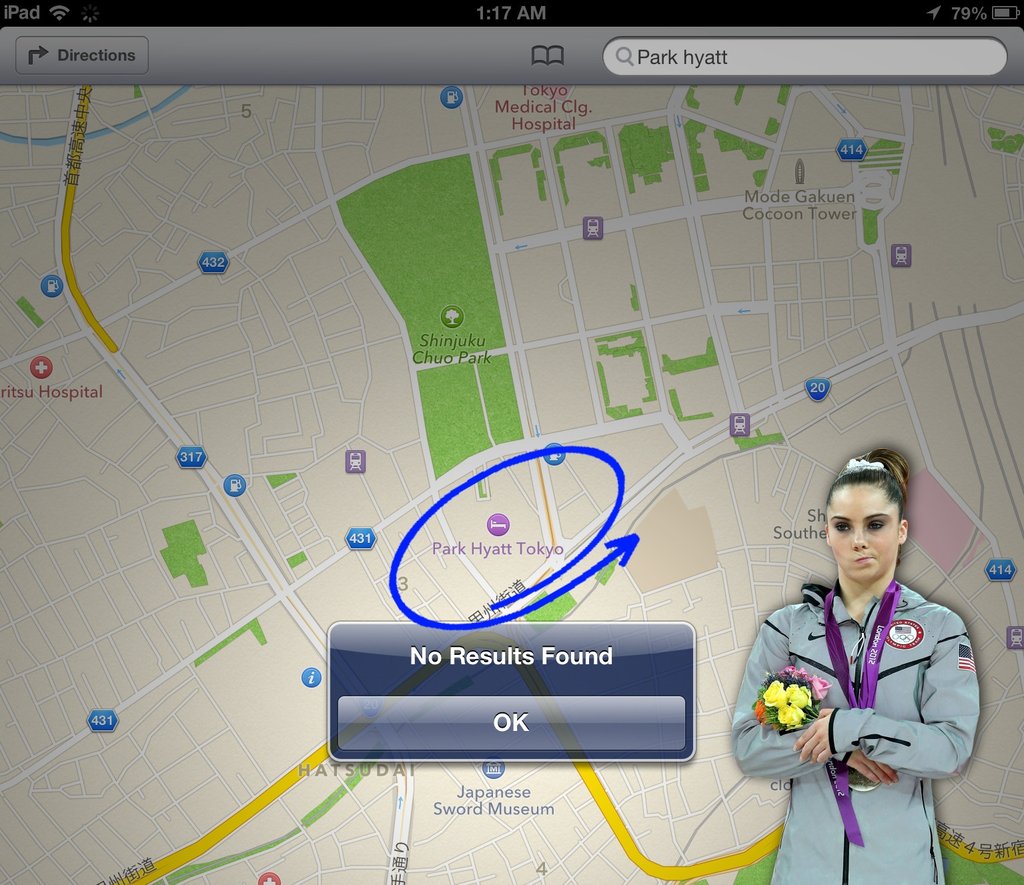
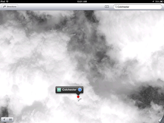
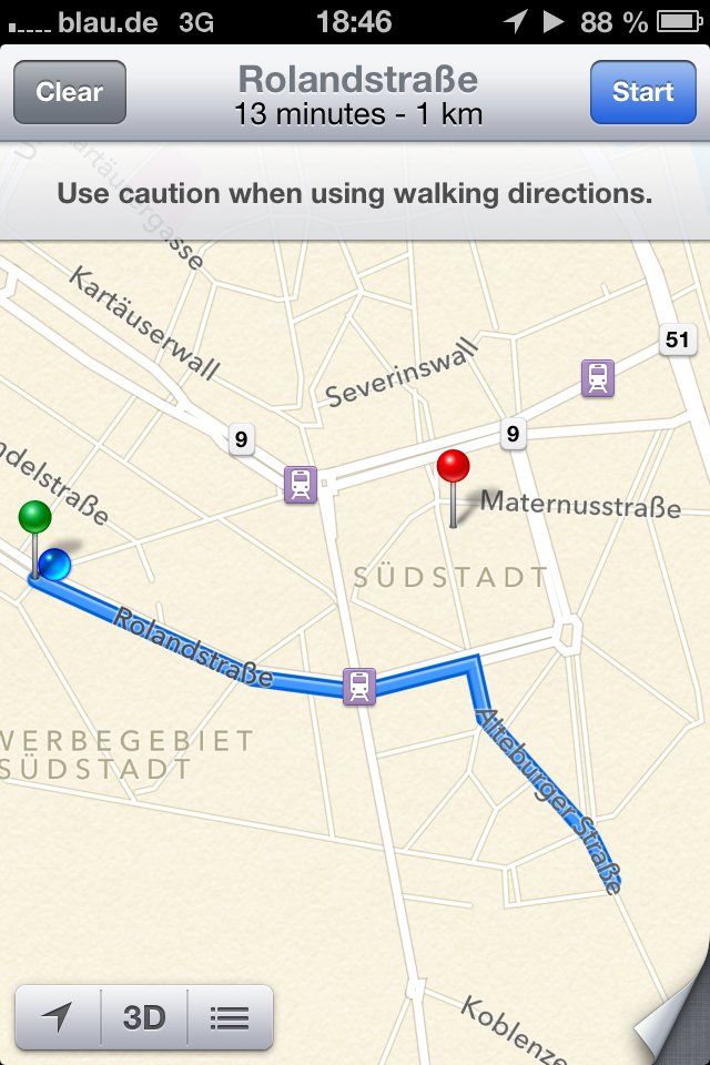
So what’s wrong with Apple’s maps exactly? A whole new Tumblr page has been created especially to show the problems, and some images can be seen below:


A bumpy landing lays ahead
Oulu is the biggest city in Northern Finland, but iOS doesn’t know where to find it
This is Bogota, Colombia. Apparently.


Mashable also has another collection of iOS6 map photos


This is Apple’s idea of walking navigation. The red pin marks where the blue line should be going
Mumbai does actually exist.
Looks like the Brooklyn Bridge needs some structural attention.
 

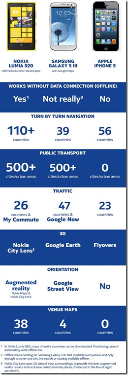
Not missing a beat in recent months, Nokia has used this opportunity to explain how its own mapping services are the industry leaders. The new aggressive marketing from Nokia is a moment to revel in for its consumers, given the company’s reluctance in the past to hype its own innovations. In the arena of maps, Google is considered the one to beat. That may be true for mindshare, but when it comes to the most superior product, Nokia stands without peers.


Somehow, Apple is still employing its ‘reality distortion’ field and telling people that “it’s the best mapping program on any mobile platform“. The world begs to differ Apple…

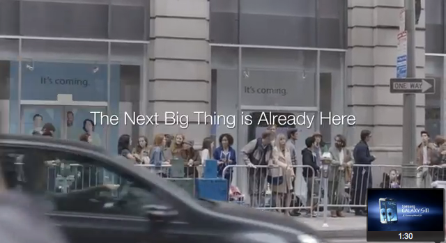
Samsung Takes a Swipe at Apple (& Users)

Samsung isn’t known for being the most respectable company, or one that oozes integrity, so it comes as no surprise to see the following video came from Samsung rather than another smartphone vendor. Opinions on whether it’s right or wrong though, it has to be handed to the Korean company – it has found a nail and hit it on the head. Samsung isn’t much of an innovator in the mobile space, preferring to load its devices with unnecessary specs (anything to make Android lag less though, right?) and market them on that. However, each year Apple comes out and announces a device that ignores the industry standards, shuns compliancy with existing technologies, and lacks features. From day one the iPhone lacked something as simple as 3G connectivity; the 4S launch brought remarks of “the iPhone 5 will have the big features next year” and the iPhone 5 came out with a slightly bigger screen, sub-par maps, and panoramic picture shooting. No NFC, no improvements to the screen’s visibility outdoors, no microUSB, and so on. Once again, iPhone users are left waiting another year in the hope of getting a genuinely new, innovative feature.


Apple Mobile and Music refresh 2012 a.k.a Let-Down of 2012

Last week, Nokia announced its new flagship mobile phones – the Lumia 920 and 820. Although the hype was certainly there, the interest was not and Nokia’s stock continued to drop. Tonight, Apple showed off its newest iPhone and musical device/software refreshes. Hype was certainly there, interest and wow factor…not so much and the really annoying thing is, I predict its stock will still keep rising.

Tim Cook and iPhone 5

Led by new CEO Paul O’Grady…I mean Tim Cook (seriously they really do look like each other), Apple’s September event kicked off as usual with some statistics on how well the fabled glass and metal products are selling around the world. Awesome. A few minutes in and the iPhone 5 was unveiled. The naming of the device is totally logical seeing as it is the sixth iPhone and therefore iPhone 5 is the obvious name for it. To those of you that saw the leaked images and rumored designs of this new device, it is exactly the same. Like with every iDevice launch, there is little to no surprise as with the help of the Internet everyone knows exactly what to expect. The non-surprises don’t end there; the new iPhone has a 8-megapixel camera that improves on the one found in the 4S with some new technologies that make shooting in the dark or finding the nice bokeh background easier; it certainly took me by non-surprise. The new iPhone also has LTE capabilities, meaning a faster 4G antenna. For those of you who aren’t familiar, 3G was like broadband for the mobile phones, 4G/LTE is like fiberoptics allowing a very quick data connection to your mobile when you are in a supported area. The iPhone 5 will also have Bluetooth 4.0 and of course iOS 6, the features which were covered in one of my previous articles. Oh and a quicker A6 processor. All these updates seem a bit dull and expected but wait! There are a few new things the iPhone 5 offers that lift it a step up from dull to mundane.

Insert here.

The new iPhone 5 has a redesigned dock connector. Gone are the days of the nine year old (seriously that long ago?!) 30-pin iPod connector and in is the new “Lightning” connector. The cable still uses USB but one can probably assume that it will be 3.0 with the possibility of there being a Thunderbolt alternative. Given the naming of the new connector, I reckon this is very likely. The new connector is also reversible meaning that it is the same when rotated 180 degrees reducing the possibility of a broken port when fumbling around the charger in the dark after a night out.

One plays basketball...

And finally, the iPhone 5 has the long rumoured and debated larger screen. Measuring in at 4 inches diagonal, it is still one of the smaller screens in the world of touchscreen smart phones. Apple’s reasoning being this is that it wishes to preserve the fact that a phone should still “fit” in ones had. In order to maintain the iPhone 4’s Leica-Camera-like form factor, the iPhone 5’s display is merely longer with 1136 pixels across as opposed to 960. Still shy of the 720p displays that many smartphones are now sporting. Heck the Lumia 920 has a whopping 1280×768 in a 4.5″ display. That’s 35% more pixels. The display is now 16:9 widescreen aspect ratio and many apps are being updated to support this new size. It seems that this time round, Apple was more focused on the form factor because the iPhone 5 has a metal back and is much thinner than the 4/4S but at what cost? Is the 4 inch display really enough to rival the competition?

Simple is better?

After the iPhone 5 came iTunes. iTunes has been updated to version 11 with a redesigned user-interface, a simpler store that is the same across all Apple devices and more social integration. By that I mean there is a “Like” button attached to almost everything. The new iTunes needs to be used rather than described as it is more about the interface rather than features. The only actual new feature seems to be the iCloud integration for those into backing stuff up in the sky and even that isn’t very new as everyone knew it was coming anyway.
Bit of discrimination?
Another non-surprise was the iPod Touch. With every release of an iPhone, the iPod Touch models also get an update to keep up with the apps that will be inevitably developed with the iPhone as a priority over the iPod. This time was no different. The new iPod Touch models are updated with the new 4 inch display and better cameras front and back. The processor has also been updated to the A5, a step down from the A6 in the iPhone 5. And like it’s mobile bigger brother, the iPod Touch sports the new Lightning connector. It comes in various colours and has a pop out bit to tie a strap to much like a pocket camera.

I hate round icons...

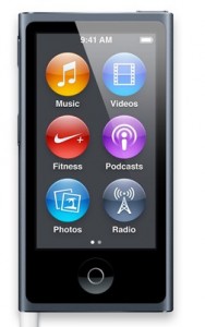
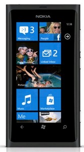
Finally, two refreshed products that I genuinely did not see coming. First the iPod Nano. Completely redesigned and now looks like someone nicked an iPod Touch from Tinker Bell. It has a 2.5 inch touch screen and also a home button not dissimilar to the one on the iPod Touch. The display is also multitouch. For the first time, the iPod Nano gets Bluetooth 4.0 which means better handsfree capabilities whether in the car or the gym. Aesthetically, the Nano looks shockingly like the Nokia Lumia range:

Will Nokia sue Apple for copying its design like Apple sued Samsung?
Fit for a stormtrooper

The last product was the Apple earPods. Redesigned earphones that will ship with all new iDevices.

So Apple has announced its new products and every year, my hype and excitement decreased. Probably because the smartphone market is so saturated and innovation is dwindling. It is hard to come up with something new without it being copied or ridiculously useless. The iPhone 5 was everything I expected and nothing more. When the iPhone 4S receives the iOS 6 update, it will be the same phone, just shorter. Frankly the only thing that grabbed anything that resembled my attention today was the iPod Nano getting Bluetooth. The iPhone still lacks NFC, the hardware has not improved to play audio at a remotely acceptable level through the speakers, the recording capabilities have not improved, the camera is much the same except for improved low-light conditions (which was absolutely necessary). Compared to the Nokia Lumia 920, which has PureView, PureMotion HD+ screen that can be used while wearing gloves, and Rich Recording that can record up to 140 dB without losing clarity, it’s clear where the real innovation lies.

People will naturally queue to get their hands on the iPhone 5 but I have a feeling that the numbers will not compare to when the iPhone 4 launched. A month or two ago, I stated that Apple had better pull it out of the bag or my next phone will be something different, thus severing my last tie with Apple. I am due an upgrade in November, guess it won’t be an iPhone anymore.

Nokia Lumia 920 Review: The World’s most Innovative Smartphone

Yesterday Nokia unveiled its latest and greatest at Nokia World. The two devices shown were the Nokia Lumia 820, a successor to the current 800, and, the Nokia and Windows Phone 8 flagship and dubbed The Most Innovative Smartphone in the World, the Lumia 920. Giving a phone such a title is a bold statement, but Nokia has packed a lot of tech into the handset. The main problem with the announcement though is that once again, Nokia demonstrated a remarkable lack of ability in giving one.

CEO Stephen Elop is comfortable on stage – clear, concise, articulate and confident. Quite why he doesn’t do the presentations, like Steve Jobs always did, is a mystery. Instead, he welcomed Jo Harlow, who stuttered and stammered through some impressive features with a tone of voice that suggested they were very ordinary. Then Microsoft’s Joe Belfiore, who appeared to tell people what he told them back in June – that WP8 allows resizable tiles. Only this time he appeared on a mission to put everyone to sleep. Thanks Joe. And then Kevin Shields. Actually someone who is excited about the tech, and gives good demonstrations. But you’re unlikely to see someone else as annoying and loud on stage.

Yet, despite the presentation issues, the keynote got attention. Switch to Lumia, Windows Phone 8, Nokia, Lumia 920 and PureView were all trending on Twitter, and there were some remarkable technology features unveiled. What was most refreshing was that some of the features address some of the most common and annoying problems of owning a mobile phone, but which often go overlooked by other manufacturers.

The screen is one such issue. Everyone is familiar with the pain of trying to read something on the screen on a sunny day, especially in direct sunlight. By ‘pain’, I mean ‘impossibility’, especially on a dark background. Samsung’s approach to screens is to make them bigger – which doesn’t help; the Galaxy S II decided to make the default email client a black background with grey text, making it hopeless to read outside. Apple brags about Retina Display (which is nothing but a marketing term for ‘we have many pixels’). Yet Nokia yesterday unveiled its approach. It has long been using ClearBack Display technology to make screens easy to see outdoors, and the Lumia 900 was voted the best readability for such purposes.The 920, though, takes it further. Not only is the screen HD+ (which has more pixels than Retina Display), it has smart polarisers to help you outdoors. What does that mean? It means, much like the eye glasses that do the same thing, that the screen automatically adjusts itself depending on the sunlight to reduce glare. Meaning this is a device you can comfortably read under bright sunlight.

That alone won’t be enough to set the sales rocketing, but it is good to see a company focusing on improving the experience to such an extent that the typically overlooked aspects are still being improved. Perhaps the biggest announcement regarding the screen though was the ability to use the phone while wearing gloves. Nokia calls this Super Sensitive Touch. One of the big debates surrounding capacitive screens vs resistive screens was that the latter registered touch input from anything – styluses, keys, gloves, and so on – whereas capacitive only registered flesh, or special products that were designed to touch capacitive. Super Sensitive Touch for the first time combines the technologies, allowing the smoothness of capacitive with the benefit of being able to touch it with anything. The main area this is a concern of course is in cold weather when wearing gloves – every phone on the market with a capacitive screen requires the gloves to be taken off. Kevin shields demonstrated this working onstage not with thin material, but with heavy-duty ski mittens. This Super Sensitive Touch will end the frustration of tapping a screen at the wrong angle and nothing registering because it was the nail, not the flesh, that made contact.

Nokia also demonstrated its advancements in mapping technology. Google Maps may be the first port of call when you want directions from a computer, but Nokia’s offering provide perhaps the best in the world. With complete offline navigation and free turn-by-turn navigation, you can even be directed indoors. Nokia Drive, its satellite navigation app, has been updated so that it learns your daily commute and even tells you what time you need to leave home to account for traffic. But what got most attention of the location services yesterday was Nokia City Lens, the augmented reality app that offers a more intuitive way to discover the world around you. You can point the camera around and it will show you places to eat, drink, theaters, cinemas and so on. Point it at a building with shops inside and it will even tell you what’s in there. If you find a restaurant, you can simply tap it and see photos, reviews, and call directly to book a table. All by looking through the camera. With the current alternative to this being pulling up the search engine and finding local points of interest, the leap in the ease of exploring a new place is quite remarkable.

So far, this is all good stuff. But Nokia had two particular gems to show off. Wireless charging was one of them. While this feature is already around on the HP Touchpad, Nokia is the first to popularise it on what will be a mass market consumer product. The benefits of it are obvious – no more wires to trip over or lose, no wearing down the USB port on the phone or pulling it loose, and, thanks to certain partnerships, you don’t even need to worry about charging when you’re out and about. Virgin Atlantic’s Heathrow lounge will have recharging pillows, as will Coffee Bean & Tea Leaf, large coffee shop franchises in America. Sit down, open the paper, and your phone will charge while sitting on a small fabric on the table too.

As part of this, Nokia spoke about the Lumia’s NFC capabilities, being able to pair up with wireless headphones and speakers by simply tapping them together – but, the NFC speaker they demonstrated featured a wireless charging area on its top, so the phone can charge while playing music. Imagine an iPhone dock, but without plugging it in.

The second big announcement was somewhat expected: the camera. Long revered for its imaging superiority, Nokia was expected to make a big announcement. After the 41MP PureView handset announced earlier this year, and the N8 two years ago, it was clear the Lumia would get some camera enhancements from Nokia.

The Lumia 920 comes packed with PureView, the stunning new optics technology. The 920 has floating lens technology, allowing more light to enter the camera to not only take clearer pictures in low light, but also reduce blur to produce clear photos every time. Not only does the 920 capture between five and ten times the amount of light of any competitor smartphone, it also lets in more light than most DSLRs. The short video below shows the breathtaking capabilities of taking pictures in extreme low light.

Nokia demonstrated some low-light comparisons between the Lumia 920 and a competitor (it wasn’t named directly, but they tended to use the Samsung Galaxy S 3). Competitor’s attempt is the first photo of each set, PureView second:

Also within the camera advancements, Nokia announced two ‘lenses;” Cinemagraph, and Smart Shoot.

Cinemagraph elevates photos to something else, as they allow movement. By selecting a photo then entering Cinemagraph, users can simply rub the area they want, and it will then start to move.:


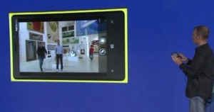
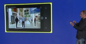
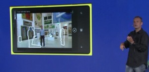
SmartShoot continues the trend of the screen advancements in solving a common problem: people walking past your camera as you want to take a picture. We all know the feeling, and there’s no way around it other than waiting for everyone to get past and take the picture quickly before someone else walks by. Unless you own a Lumia 920, in which case you can use SmartShoot, which analyses the moving sections of a photo, then removes them:

All in all, it was an impressive demonstration. It would have been more impressive still if Nokia could learn how to deliver a truly excellent keynote, but the features largely spoke for themselves. Wireless charging, unparalleled mapping experience and peerless camera technology certainly puts the Lumia 920 amongst the most desirable handsets. And while Apple has been bragging about the ‘resolutionary’ Retina Display, Nokia has not only made it brighter, and packed 2.5 times more pixels than the nearest competitor to offer blurless scrolling, it also packed it with smart polarisers, and allowed any material to touch it and register.

The World’s Most Innovative Smartphone may just live up to its name.