Apple Being Sued Over Siri Woes

When Apple announced the iPhone 4S, the main feature to set it apart from previous offerings was Siri, a virtual personal assistant. With all its products, Apple claimed Siri was amazing, incredible, and unlike anything else (which no doubt angered Vlingo). What wasn’t so readily mentioned by Apple (instead buried away in a crevice on its website) is the fact that Siri is still in beta. The adverts showing Siri behaving like a portable Yellow Pages and fortune teller also omit this, along with any disclaimer that the feature may not work as well as advertised. To make matters worse, Siri doesn’t know business information or certain location-based information outside of the US – unlike its rivals Vlingo and Windows Phone’s Ask Ziggy.

So Apple’s flagship feature has landed the company in legal trouble once again – following the tradition of Apple being sued after an iPhone release, with users suing the company over the iPhone 4 “antenna gate” problem whereby holding it a certain way dropped calls (leading to Steve Jobs’s famous retort to “not hold it that way”, before getting up on stage to declare (falsely) that it’s a problem to plague all mobile phones), and an earlier court case where Apple got in trouble for claiming the iPhone offered a “full web” experience when it did not provide access to Flash content. This time around, it’s a man from Brooklyn, Frank Fazio, suing Apple, with the case claiming that Siri does not work as advertised because it produces incorrect answers, fails to understand what is said, doesn’t locate local shops and can’t understand directions, whereas the adverts show Siri understanding and replying to all these things without missing a beat, and even assisting people to learn music.

The inclusion of Siri led Fazio to spend $299 on an iPhone 4S, and his disappointment with how it performs has led to the case, which states that “The iPhone 4S’s Siri feature does not perform as advertised”. While it has yet to be decided in court if Apple has been misleading or not, Fazio is only one of a growing group of 4S users and critics frustrated with Siri, which seems to be hugely overhyped in the adverts. Other complaints of the service include it having a difficult time understanding non-US English accents (although it also seems to have trouble understanding American accents), and with Siri requiring an Internet connection to work, as most processing is done not on the phone but on Apple’s servers, it will not work for anyone without a connection. This particular problem was particularly troublesome when Apple had an outage that rendered Siri unusable for about a day.

Whether Apple’s claims are misleading has yet to be decided, but Fazio is part of a growing chorus of discontent over Siri. Despite an initially positive reception from reviewers when the iPhone 4S launched in October, users and critics have raised complaints about the iPhone 4S’ oft-hyped feature. The biggest complaint is that Siri requires an Internet connection to function since most of the heavy-duty processing is done on Apple’s servers and not the phone itself. So if you are without connectivity, Siri will not work. And the phone doesn’t even have a backup feature, such as the iPhone’s old voice control features, for basic Siri-like functions such as voice dialing. Siri’s connectivity limitations were highlighted in November when Apple suffered an outage that knocked Siri service offline for about a day.


Unboxing of the White Nokia Lumia 900

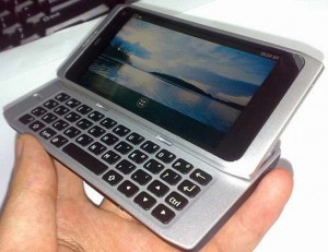
The Lumia 900 is the current high-end Windows Phone offering from Nokia, with a 4.3″ ClearBack Display and front-facing camera. The device is announced but not yet released, and from an aesthetics perspective, it is perhaps the most desirable Windows Phone yet. The Lumia 800 has the same design as the Nokia N9, which the 900 is also similar too, and in white the phones are reminiscent of the leaked images of Nokia’s white N950, the developer edition of the N9. The beauty of the N950 was its noticeable similarity to the stunning Macbook range:


Review: Atmos Raw Vaporizer

Attention vapors! There’s a new vaporizer in town that’s portable and compact. Resembling that of an e-cigarette and coming in three colors, the Atmos Raw Vaporizer offers tobacco lovers such as myself an alternative to conventional cigarettes and e-cigarettes. As someone who enjoys a few good smokes a day, I am not going to lie to you by stating that this is in any way as satisfying as an actual analog cigarette; at the same time, however, I personally have found it to be much more satisfying and less irritating to the mucus membranes than propylene glycol based e-cigarettes. I have also found it to be far superior to the Ploom Vaporizer that I reviewed on my blog last year.

At 5 in x 0.5 in, this vaporizer offers up some impressive features that I have not yet seen in other vaporizers to date:

-Its battery is chargeable via the USB charger and wall charger that are included in the original purchase.

-Once charged, this vaporizer boasts 72 hours of continuous usage before needing to be recharged.

-It works with dried blends, such as ryo tobacco.

-It heats to 400 degrees Fahrenheit, just below the point of combustion.

-A mere 5 second heat up time is all that’s needed.

-There is an automatic shutoff feature that discontinues heat after 9 seconds of continuous use.

-For smooth vaping, it only takes a couple of seconds to reactivate the temperature.

-It’s discreet.

-It’s windproof.

-You can use it anywhere.

-Much less tobacco is required to satisfy your nicotine cravings.

….and now for my favorite feature: It comes with a two-part filtration system that consists of one mesh filter + one ceramic filter that filters the vapor while further cooling the vapor for a more comfortable vaping experience. This is the first vaporizer that I have tried that has not made me immediately cough. I do believe that it is the ceramic vaporizer that is partly responsible for the lack of irritation. There is also no need for propylene glycol or glycerol based e-juice, which can be highly irritating for many of us who are intolerant to these additives in high doses. Another bonus for tobacco lovers like me is the fact that vaporized tobacco can be quite tasty!

Overall, this is my favorite harm reduction product thus far, apart from filtered cigarette holders and the Eclipse cigarette (which could use some help in the flavor department), though it does have a few negative aspects with regards to the overall design:

-If not placed properly, the tobacco can sit directly on top of the heating chamber causing some combustion. This situation can be remedied by inserting an additional mesh screen into the bowl. By placing the extra screen to where it sits directly on top of the heating chamber, one can avoid combustion entirely.

– It’s not the as satisfying as smoking, but it sure does help to alleviate the craving if one is in a situation where they are unable to smoke.

-You don’t see any smoke, well, because there is no smoke, just vapor.

-You have to hold the ignition button every time you inhale.

Aside from its few flaws, I feel that the Atmos Raw Vaporizer is the closed thing to being a viable and satisfying substitute for the real thing. I do feel that it is only a matter of time until major improvements are made to this design.  Of course I’d like to see vapor like one does in an e-cigarette, but the trade off is worth it in my opinion, as the taste is far superior to that of an e-cigarette. This product has the potential to help heavy smokers cut down on the number of cigarettes smoked per day. For some people, it may even be a suitable alternative to cigarettes entirely. The beauty of the whole idea is that you get to use real tobacco; this is sure to please the purists amongst us. At $189.95 this is not a cheap purchase, but well worth the investment if you’re a tobacco enthusiast who’s into the concept of harm reduction. Here’s to the future!!


Has Apple Become What it Once Railed Against?

The above video is Apple’s (in)famous advert announcing the launch of the first Macintosh computer, which would compete with IBM’s latest offerings. At that time, Steve Jobs, ever the drama queen, expressed that being outsold by IBM would lead to a “Dark Ages” of technology, and that Apple – as the tacit technological heroes – must come in and save the day. With the Mac due to launch in January 1984, the advert was portraying the masses blindly going along with other computers, and the individuality expressed by Apple saving the day – and thus saving the world from a technological Dark Ages.

The irony though is that Jobs has always been bent on controlling Apple computers and how the user interacts with them. So intent was he on moving towards point-and-click with a mouse that he instructed the original Macintosh to have no arrow cursor keys on the keyboard, thus forcing users to interact with a mouse even if they didn’t want to. When asked if he wanted to conduct market research into what the public wanted, he responded that he didn’t because the consumers “don’t know what they want until we show them.” Far from being the antidote to the Big Brother of 1984, then, Jobs was shaping his company to be exactly that by controlling how the user interacted with the machine. This control went right down to such levels as designing the computer’s case in such a way that only Apple engineers could open it, removing the possibility for users to open it up to look inside.

Fast-forward to today and Apple’s portable devices – the iPhone, iPod and iPad – still adhere to this philosophy. In some ways it’s beneficial – by controlling the hardware and software Apple is able to produce a seamless user experience. The downside, however, is that the user is severely limited in how they use the devices. This means that, by Jobs’s own acknowledgement, the portable devices all look and act exactly the same. And the focus on simplicity has meant that many features have been stripped from the products. The iPhone, for example, was extremely limited in its first release, to the point that it lacked 3G connectivity, GPS and bluetooth transfer capability. Although it has progressed a lot since 2007, it hasn’t introduced anything revolutionary since its inception and indeed still lacks many features offered in other devices. Its uniqueness now lies mainly in its number of applications available – yet many of these apps are merely making up for the lacking native functionality.

Apple workers were quick to talk of Steve Jobs’s “reality distortion”, which essentially means his ability to twist and distort facts to suit his ideas, and persuade others to believe him. This is something the public has been able to witness in his public keynotes, and it allowed him to sell products that lacked many features as “revolutionary” and “amazing” – buzz words he used for all his products to convince the public that that’s exactly what they were.

While the “1984” advert has gone down in history as one of the greatest advertisements ever made, there is the wondering of whether Apple should have been the company to release it. After all, what’s more Big Brother than restricting something to such a degree that users are forced to adapt how they use it? While cursor keys have made it back to Apple keyboards, the ethos is still present. In iTunes, purchased items can only be played on Apple’s software – forget trying to put the iTunes film you purchased onto any other device than an Apple one. If you have an iPad, thanks to it missing the industry-standard of a micro-USB port, if you want to connect a digital camera to place your photos onto it, you need to spend more money purchasing Apple’s own cables to allow you to do so.

But to what degree does this “walled garden” approach genuinely benefit the user? Certainly, a good experience is given to the user by Apple managing its own hardware and software, so it can ensure that the experience is seamless. But it’s likely a stretch of the truth to suggest that micro-USB ports cannot be included without ruining the user experience, or giving a degree of customisation to the iPhone and iPad will ruin the experience. It seems instead that the ideology was born from Jobs’s desire to control – something that he never tried to hide, and Walter Isaacson’s biography of the man explains in great detail the lengths to which Jobs would go to ensure control of his products.

With Jobs’s untimely death and a new CEO at the helm of Apple, it will be interesting to see if more flexibility becomes of the iDevices.

Nokia Vibrating Tattoo – Never Miss Another Call

Nokia has filed a patent for a ferromagnetic material that can be applied to people’s skin, either sprayed, stamped or tattooed in the traditional way. When the phone gets a notification – SMS, email, phone call etc – the tattoo will vibrate alerting you to it.

The premise is explained in more detail at the Nokia Connects website:


The ferromagnetic material vibrates in a multitude of ways when a message, phone call, low battery indication or several other alerts are received by the tattoo from a Nokia phone. The magnetic field can cause of multitude of different vibrations!

The magnetic mark can however remain invisible, making it more appealing to people who don’t want to visibly mark their body with a tattoo. I know I’m not a tattoo person so this would appeal to me, but each to their own! Wait, there is more….

The tattoo also acts as a form of identity. Yes, could this be the end of passports?! Maybe not, but it does mean that I would no longer need to type a password into my phone. I AM THE PASSWORD!! If I happened to be walking around blissfully unaware that my pocket was flapping open on a busy street and someone saw the opportunity to steal my phone, I would be over the moon that they couldn’t access it without a small marking on my arm!

We will let you know soon once/if the patent application is successful. Fingers crossed everyone, until then don’t leave your pockets flapping open.

Nokia: Working on Revolutionary Phone and a Tablet

According to an article from the Finnish newspaper Kauppalehti Optio, Nokia’s design head Marko Ahtisaari and his team are following up the award-winning design of the N9 with a phone that will revolutionise the user experience of phones. No clues have been given so far other than the user will not need to bend down and physically push their finger on the screen, which is intriguing. Time will tell whether this will be a natural experience like the swipe motion employed by the N9 and, to some extent, Windows Phone.

Ahtisaari stated in the interview that Apple’s offerings, the iPhone and iPad, resemble a poorly designed home because to go from one room to another requires going through the front door – in other words, to leave one place and open anywhere else requires pushing the home button. The user experience was adjusted with the release of the N9, which required only a swipe to leave one place and be back at the home screen, but whether this new phone will continue with this theme remains to be seen.

Ahtisaari states in the same article that he is spending about a third of his time working on a Nokia tablet – presumably running Windows Phone, but who knows, we could see a MeeGo comeback yet, or even the astounding bendy “kinetic” phone displayed last year, where interactions are all done through tilts and bends. Whatever route they take, it should be one to watch with CEO Stephen Elop repeatedly stating that as the iPad is the only successful tablet on the market, Nokia will not be entering the fray until it has a product that can do well. For this to happen, it would either need to be completely revolutionary or run Windows 8, clearly and explicitly telling the consumer market why that is beneficial. After all, with the purpose of a tablet being to have a more portable laptop, a well-placed Windows product could clean up being the only tablet to offer full desktop usability. As the iPad is really a glorified iPhone with the same crippled multitasking, and the Android offerings are largely painful to use, a new product that gives consumers the ability to do everything they would on their home PC but on the go could be exactly what a tablet is all about. And if Nokia used the concept design in this post’s image, it would certainly stand out from the crowd.